
A look at how I improved the usability and impact of the design system at Babylon.
The design system team
My responsibilities
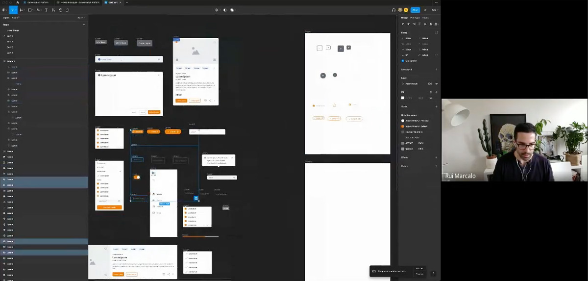
When I joined Babylon as a Senior Product Designer for the "DNA" Design System team, I ran a quick user survey with my colleagues to discover areas for improvement. The most common complaint from designers was the usability of the Figma component library.
The layers are too complicated, some variants are completely broken, and the categorisation is confusing.
I wanted to find the best way to reorganise the component categorisation without adding my own biases, so I held an open card sort with the designers. I presented them with a generic component library (to avoid bias) and asked them to group them in to categories. They could then name the categories in a way that made sense to them. This allowed me to build a picture of the team's mental model of components.
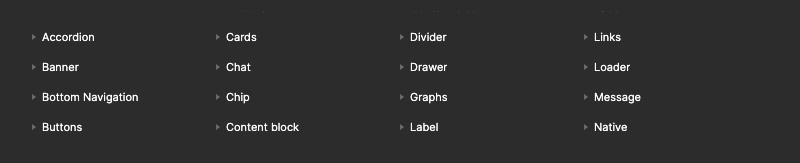
Once I understood the team's mental model, the results from the open card sort were applied to the component categories in the Figma Asset panel.
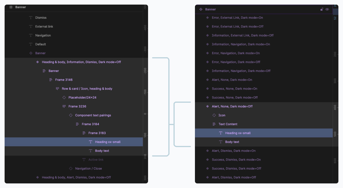
The convoluted and inconsistent layers of the components were causing variant properties and responsiveness to break, and they were also just difficult to navigate and read. I simplified all layers as much as possible and introduced consistent naming conventions. The designers and engineers found it much easier to work with the components like this, because they could more clearly see how they were structured.
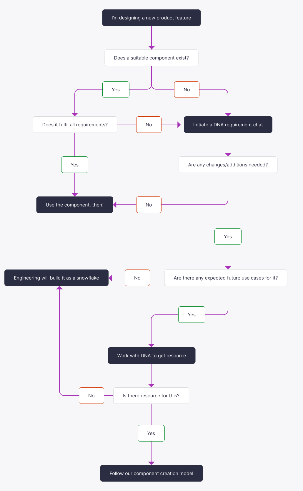
In order to keep the design system relevant and mature, it's imperative to have designers and engineers from all around the business contributing to it. For this reason, a good process needs to be designed and implemented. There was no existing contribution model, so I created one suited to the teams ways of working.
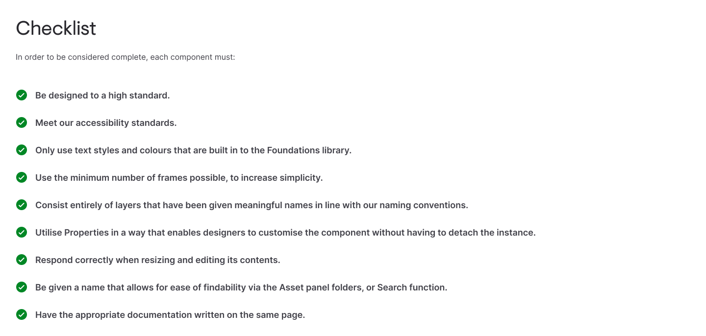
If the quality of components is not kept in check, the problems can start to snowball, and the usefulness of the design system declines dramatically. Amongst the process guide for creating a new component, I devised a checklist for quality assurance, and the designers had to ensure their components met these requirements before it would be signed off.
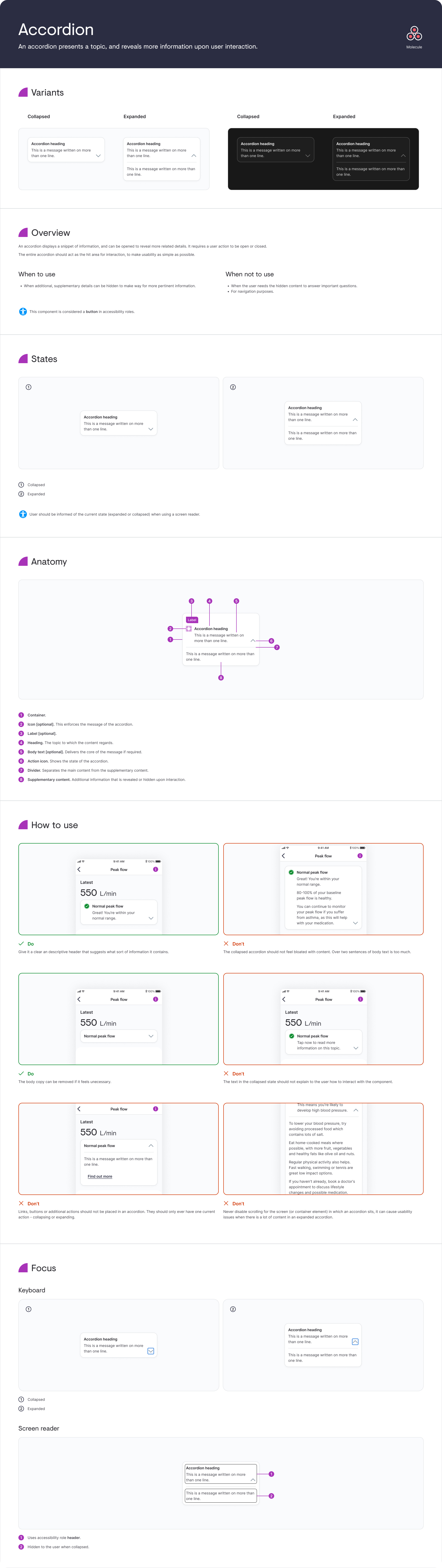
Documentation desperately needed the inclusion of accessibility notes, so an overhaul of how we documented each component was done. Here's the Accordion page as an example.
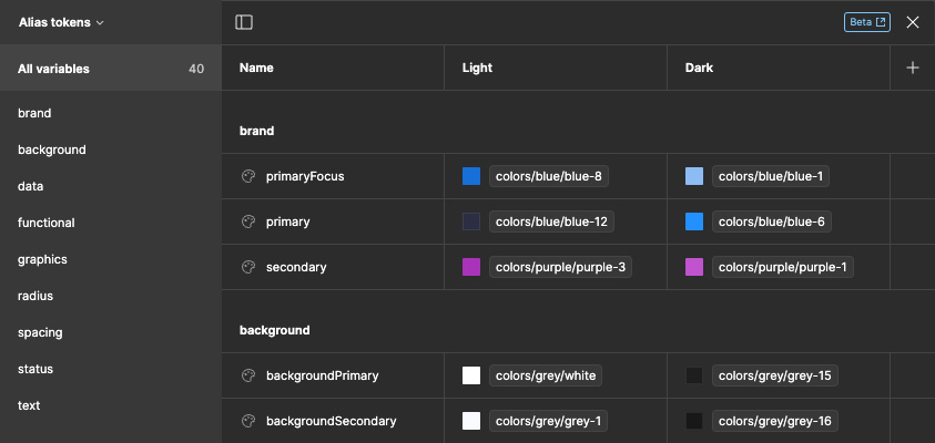
When Figma introduced the Variables feature, I took the time to edit all components using design tokens. This was achieved with 3 layers of tokens built on each other: Global, Alias and Component.
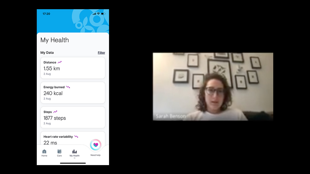
To make sure the components were effective, the DNA team would observe user testing sessions to see how they were being used. We could measure Time on Task, and see if they were working as intended for our users with impairments.
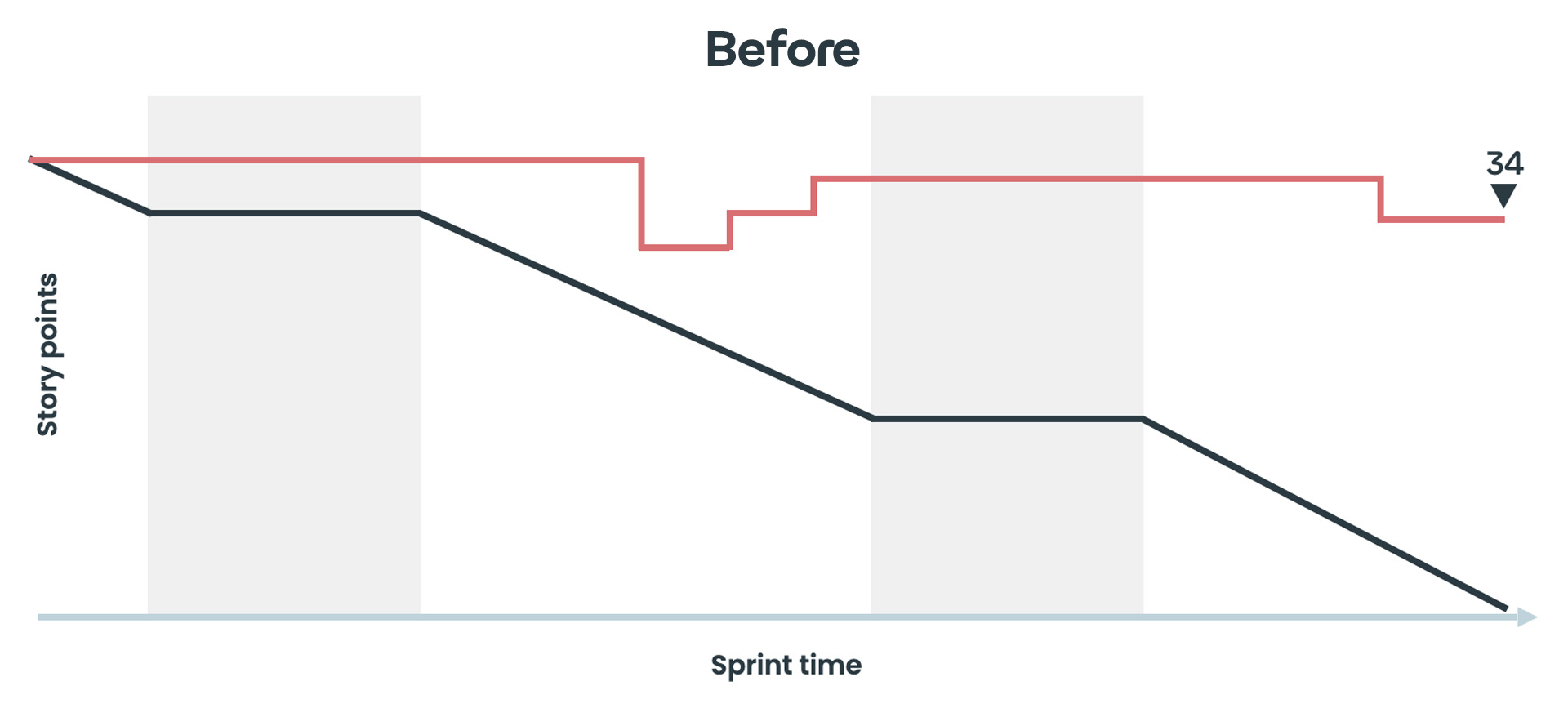
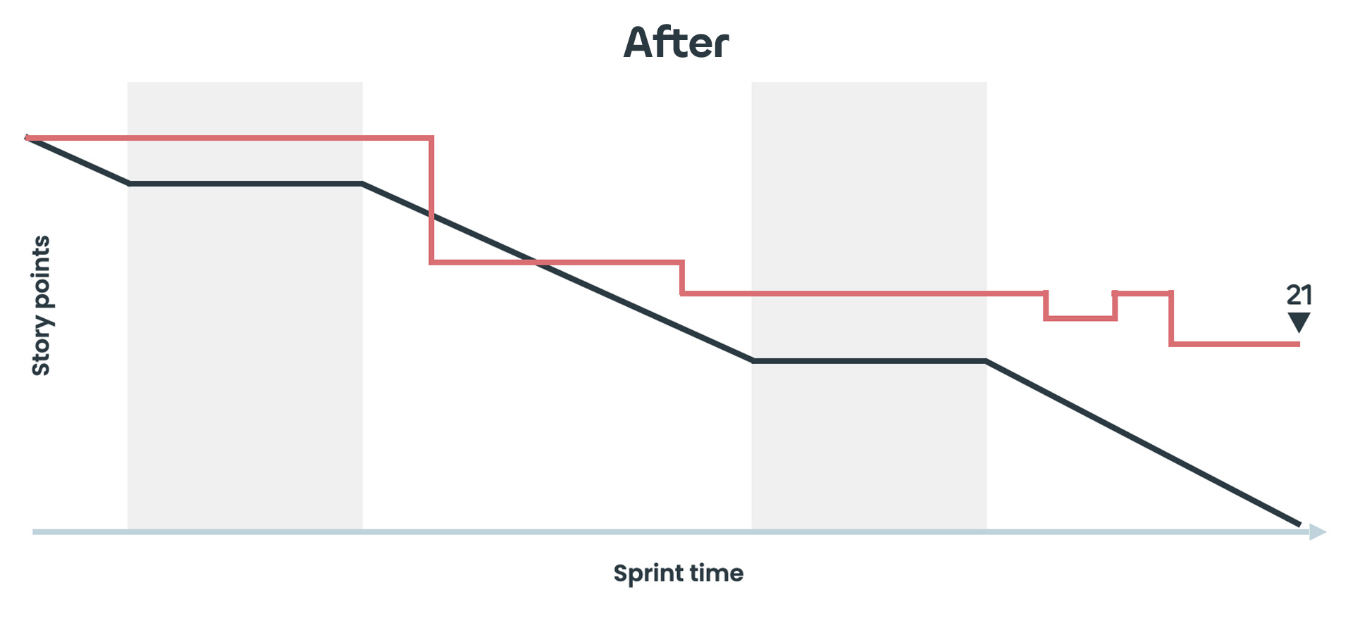
Using Jira we measured how much dev and design time the components saved, by looking at story points spent in sprints before and after the introduction of a component.
Further tokenisation. The Bupa and Telus third-party libraries would become really powerful if we used the Variables feature with them too.
Web library. The app libraries were in a good place, the desktop components needed attention.
Decision log. A better system for documenting decision-making could be implemented.