
How we produced a mini-game and loyalty reward journey to keep users engaged throughout December.
The team
My responsibilities
Data insight shows that gambling customers tend to try out several gaming products throughout December, resulting in a decrease in share of wallet and brand loyalty. Sky Vegas wanted to remedy this situation by giving users a reason to come back frequently throughout the month.
As with any good project, we began by gathering information. Stakeholder interviews to see what the business needed from it, data insight to understand the problem, and results from user surveys to gain relevant customer needs and opinions.
Stakeholders made it clear that a mini-game should be part of this mechanic.
Stakeholders were brought together and shown all the gathered intel. I then guided them through an ideation session to generate a broad range of mini-games that would encourage users to return weekly in December.
The favourites of these ideas were then turned in to one-page wireframes that visualised the mini-game.
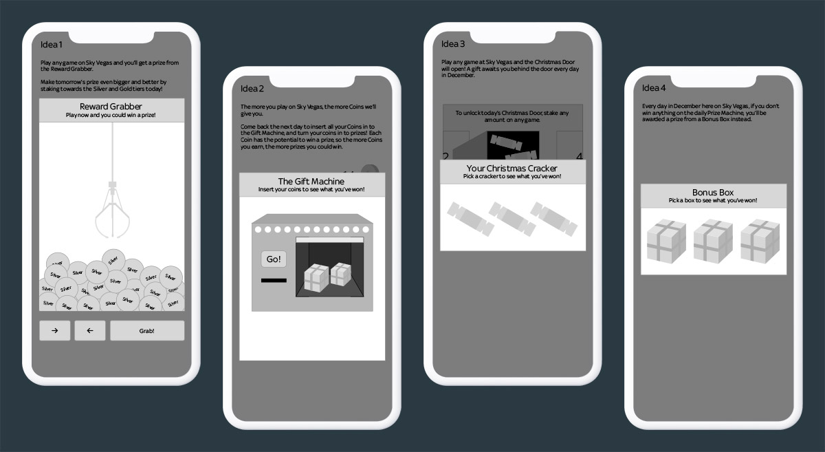
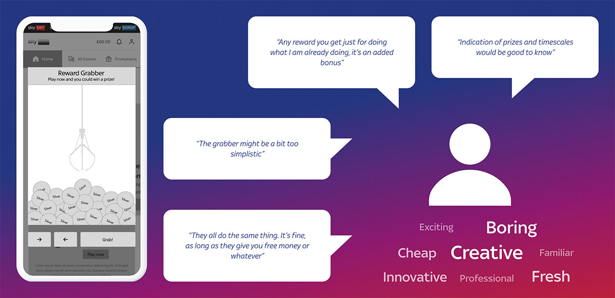
All participants were provided with a short breakdown of how each mechanic would work, and were asked which of the ideas would be most likely to encourage them to return to the site throughout the month. We gathered sentiment on each one, so we had as much useful insight surrounding the perception of these ideas as possible.
When testing was finished, two concepts stood above the rest:
Almost identical concepts, framed differently.
To explore which of the two ideas should be taken forward, we wanted to dig deeper by including the weekly journey the user would take on-site during the experience.
So before the next round of testing, we needed to figure out the user journeys. It was quite complicated because it repeated each week, and there was overlap between the end of one week and the start of another.
To really get the whole scope of this laid out in front of me, I drew up a table of every stage of the journey and listed everything the user needed to be able to see and do at that point.
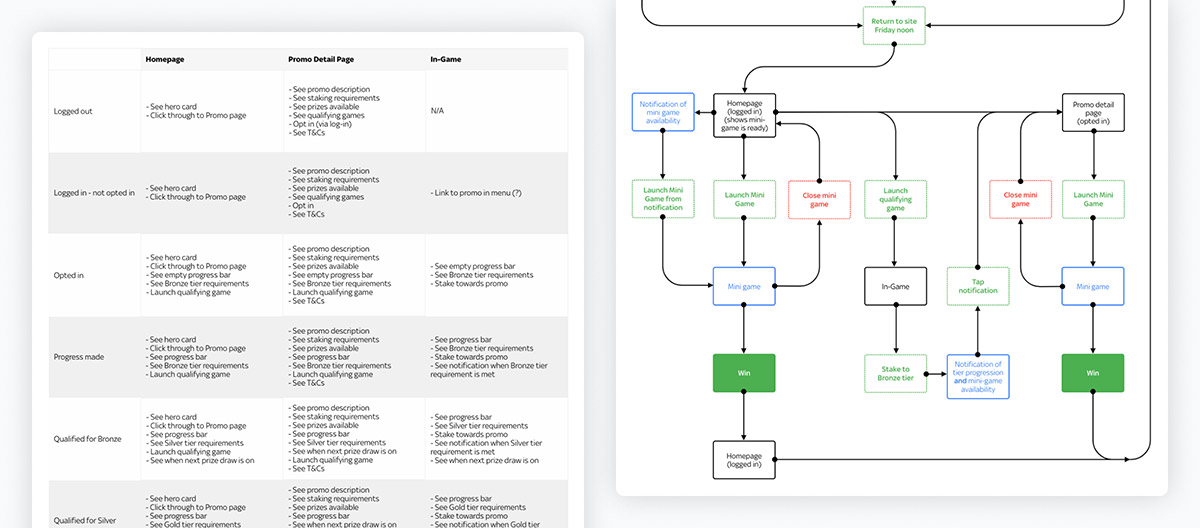
The flows were then used as a reference to mock up wireframes for the entire journey of both concepts. After showing these to the design and product teams for feedback and iteration, they were transformed into working interactive prototypes, which were then ready for the next phase of testing.
The participants were asked to run through each concept’s journey from start to end, and verbalise their thoughts so we could record their sessions and understand any issues they had using it, as well as any sentiment between the two ideas.
The gumball game resonated best with participants due to them receiving up to three rewards. The lockbox concept only gave them one reward, so the perception was that the gumball machine was giving them more, despite the value of the rewards totalling the same.
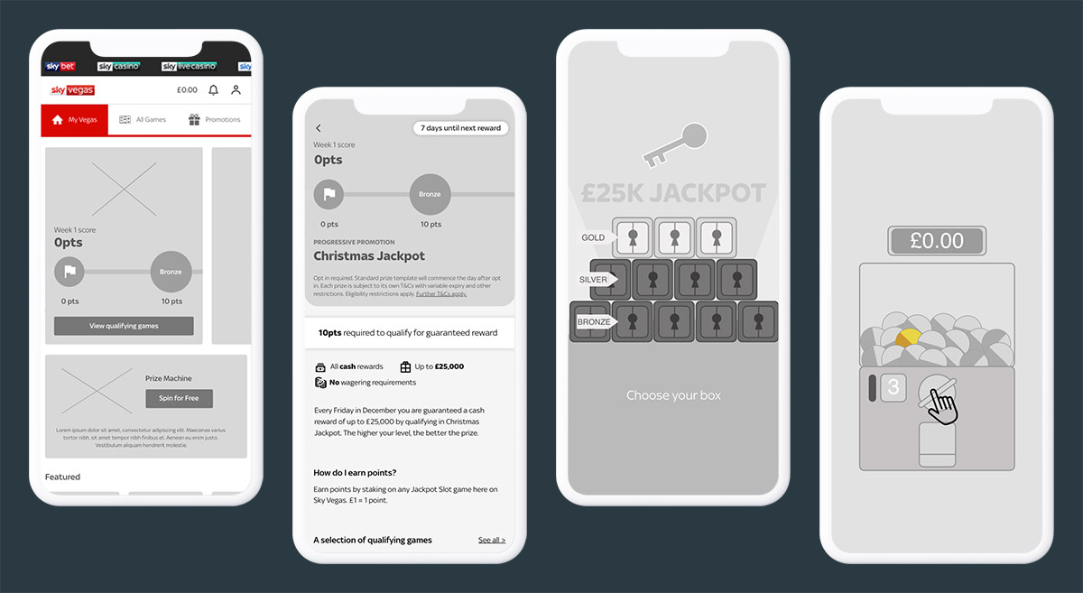
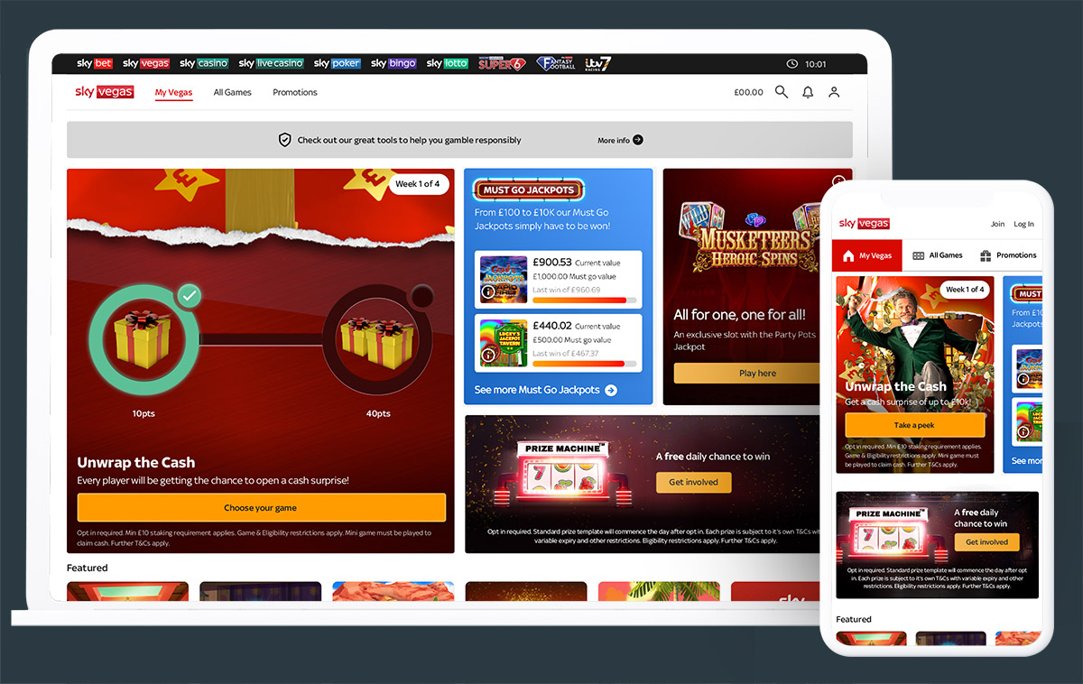
Now that the concept was decided, the brand team came closer to the project. A gumball machine wasn’t on-brand, so we wanted to turn it in to a machine that’s designed specifically for creating delivering rewards. As it would be the run-up to Christmas, the rewards were wrapped up in gift boxes.
With a new mini-game added to the prototype and some UI tweaks made to the journey, we once again put it in front of users for more observation.
From the user labs, it was clear that users were struggling to understand the portion of the journey where one week of the promotion had ended, and the next week had begun. This was because, due to the way our tech platforms worked, the users wouldn’t be able to claim their reward from the previous week until 11am, but they could also start making progress towards the current week’s staking requirements.
For this reason, the focus of the next lab was to drill down on this stage of the journey and see if we could improve user understanding. Something on the homepage needed to stand out and make it clear to the user that last week’s reward wasn’t ready to claim yet, so we tested a few concepts that might have helped.
With each further lab, we increased the fidelity of the prototype. This allowed us to start getting sentiment around the presentation as well as observing UX issues.
Once we were happy that the problematic journey was solved, we worked closely with the brand team to finalise the imagery and ensure none of it detracted from the UI.
Developers were given access to the final prototypes so they could fully understand the designs, as well as Zeplin sheets so they could inspect the code.
However, one thing that these methods don’t provide is precise information about the position and timings of animations in the UI. For this reason, I created visual demonstrations of the various animations in After Effects and wrote up a list of the CSS they’d need to implement it accurately.
The campaign increased the Bet Days Per Unique from 2.42 to 4.80, meaning the average number of days per week that the user placed a bet.
2.42
BDPU
4.80
BDPU
It also improved the Net Margin Per Unique, from £57 to £84 per week.
£57
NMPU
£84
NMPU
This was a really successful result for the campaign, and due to that, it was repeated for several Christmas periods following it.
Try reframing an idea. Sometimes it’s not the idea that isn’t working, it’s the way it’s presented.
Include the brand team early on. Discovering the right mechanic first gave UX the freedom to explore, but including brand immediately after helped transform that idea into something marketable.
Use labs to target specific problems. We ended up running a few labs to refine the weekly overlap journey, which was incredibly helpful - but we also make the prototype gradually more high-fidelity each time, allowing us to gather sentiment.
Provide engineers with specific animation details. The devs really appreciated being given the position and timing information for the animations, it saved them any guess-work and sped up their process.